
From drop offs to approved loans
From drop offs to approved loans
Understanding and streamlining the application process to ensure borrowers can secure a loan.
Understanding and streamlining the application process to ensure borrowers can secure a loan.


ROLE
ROLE
Lead product designer,
team of 2
Lead product designer,
team of 2
TIMELINE
TIMELINE
2 months
2 months
What is

?
SAVii is a Philippines-based financial wellness platform that partners with employers to provide employees with financial products such as salary-backed loans, insurance, and deposits.
Project overview
The focus of this case study is on the loan application process. Currently after signing up and creating an account with SAVii, the users are dropping off without completing their loan application. This results in reduced conversions and prevents potential customers from successfully completing the application and securing a loan.
Understanding the loan application
REVIEWING METRICS
We reviewed the user metrics across the funnel to understand at what point the users were dropping off and where design intervention was needed/possible. After reviewing the click data it was clear that three steps were experiencing more drop-offs than the others:


It is important to note that before these 5 steps, users must answer several questions to check their loan eligibility. These questions cover basic details such as place of work, income, reason for the loan etc. This is where the user enters their preferred loan amount. Users can continue with their application only if they are found eligible.
Why are users not completing the loan application?
We interviewed six Filipino users and took them through the loan application process, step by step. We spoke with some users who had signed up on SAVii but hadn't started the loan application, as well as those who began the process but dropped off before completing it.

Lengthy Application Process
Users found the process too long and tedious, which discouraged them from completing it. Expectations about the time required didn’t match reality, leading to drop-offs.

User Unpreparedness
Many users started the application without knowing what documents or information were needed, causing interruptions and abandonment during the process.

Cognitive Overload
The amount of information requested and the complexity of questions overwhelmed users, making the process feel daunting.
STEPS 1 & 3
Regrouping fields and screens
We started by first addressing the issues with supporting information and contact information screen.
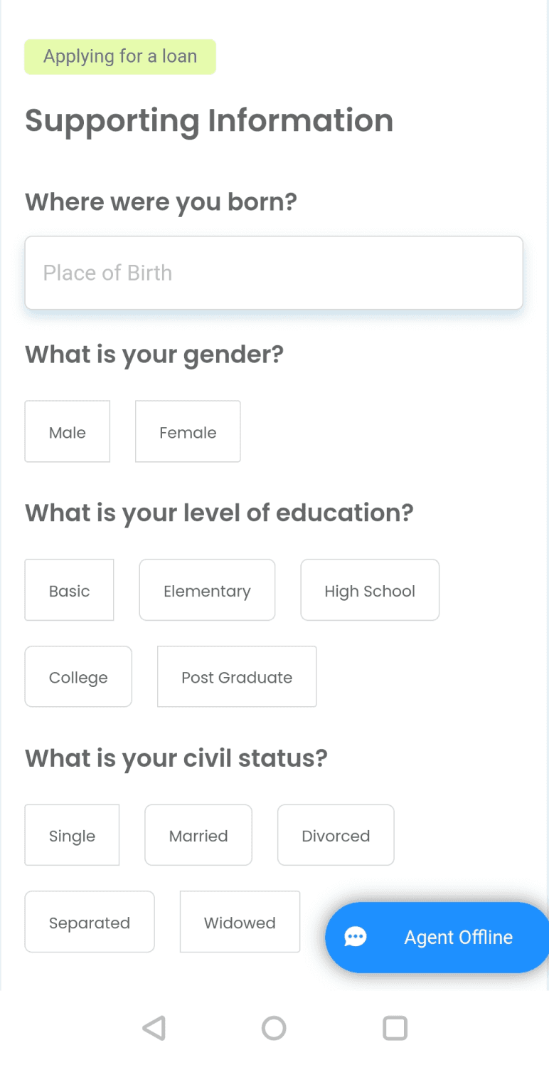

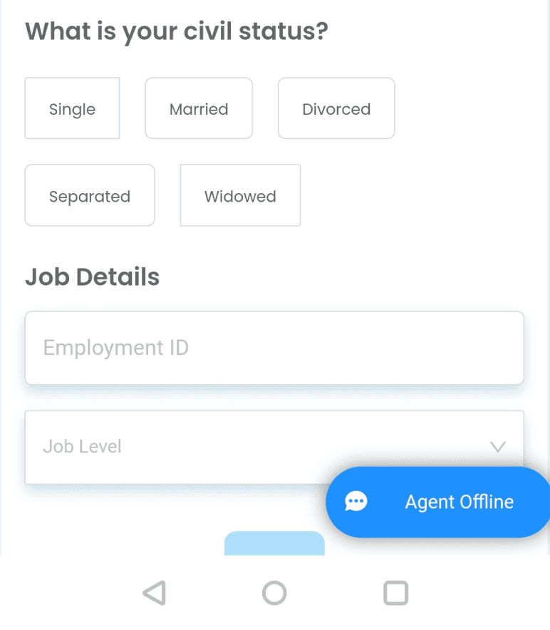
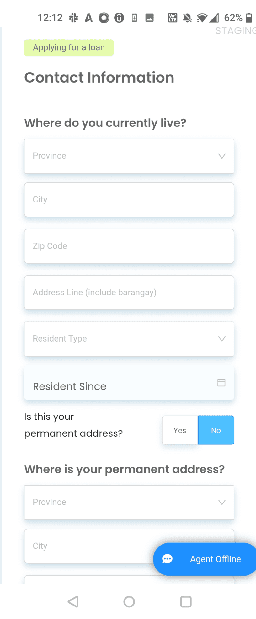
-the supporting information
screen is too long
-the questions under supporting information do not have a clear grouping
-the permanent address section is always open making the contact info too long
-the overall UI has inconsistencies and makes the screen look cluttered
Also supporting information as a term is not descriptive of what the screen entails
SOLUTION
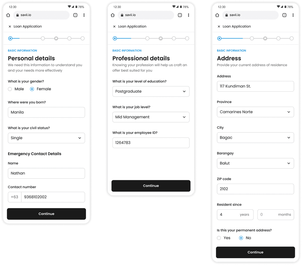
We decided to restructure the form by regrouping the fields more logically, breaking it into smaller sections and minimising the number of mandatory fields. This reduces the perceived length and creates a sense of progress.
We decided to split supporting information and contact information into 3 screens according to the fields: Personal details, professional details and address. These 3 screens came under the umbrella of basic information.

Design constraint
We couldn’t change the overall structure of the pages or steps because the PMs wanted to keep the same funnel to compare the before-and-after data.
Basic Information
SCREEN 1
Personal details
Place of birth
Gender
Civil status
Emergency contact
Emergency contact no.
SCREEN 2
Professional details
Level of education
Employee ID
Job level
SCREEN 3
Address
Current address fields
Resident type
Resident since
Permanent address fields
(optional)
STEP 4
Simplifying the Loan offer screen
The loan screen was experiencing the highest drop-off rates compared to all the other screens. To understand the problem areas we did an audit of the screen and wrote a bunch of HMWs to help us understand the problem
Users are confused by seeing both the maximum eligible amount and their applied amount.
The loan calculations are cluttered and not concise. It is not easy for a user to understand the calculations quickly
Text overload risks user getting overwhelmed & disengaged
Having the user edit details of the form on the same screen results in cognitive overload, hindering decision making
Users drop off when the loan amount they receive isn't what they initially chose.
You are eligible for this maximum offer!
Continue
4
5
Based on your information, you can comfortably borrow up to ₱162,500 over 24 months. Feel free to edit the terms below.
Edit my loan terms
Deduction per payout
We will give you
₱7357.64
With 25% interest per year
The loan amount will be sent to UPB Bank account {account_number}. Deductions may start on {disbursement_date} or after.
Make sure your bank details are correct. Uploan cannot reverse fund transfers to incorrect bank accounts or e-wallets.
Once your application has been approved, you will not be able to amend the disbursement information provided.
₱162,500
Supporting information
Disbursement channel (RCBC bank)
Contact information
Review your details
Back
English
To be repaid in
You are borrowing
₱162,500
18 Months
Bank fee
Service fee
Total deductions
₱95.00
₱3,750.00
₱3,845.00
Number of payments
Annualized interest
Interest per month
18 payments
18%
1.5%
12:30
78%
savii.io
How might we...
Based off the audit we came up with following HMWs:
HMW Simplify the loan calculations for the user so it is easy and quick to grasp.
HMW Reduce cognitive overload for the user and make the screen less cluttered.
HMW Clearly communicate the reasons for the amount provided in comparison to the amount requested
What is important to the user while making a decision?
To reduce cognitive overload it was important to get rid of unnecessary items that did not help in decision making. To achieve this we did a priority exercise with users. Based off this priority list, we relied on visual techniques to bring out the top three items.
Loan screen items
01
Loan terms SAVii is offering(Amount + Tenure)
02
Amount user will actually get after deductions
03
Monthly payments
04
Total payable
05
Deductions and calculations
06
Maximum eligible amount
07
Review details

Amount you will get
₱ 129,405
Amount you applied for
₱ 140,000
Processing fee
-₱ 10,095
Bank fee
-₱ 95
What is processing fee?
Done
Monthly payment
₱ 7,583
Amount Borrowing
₱ 140,000
Total interest (30% p.a.)
₱ 42,000
Total Payable
₱ 182,000
Done
Calculations on progressive
disclosure
We further simplified the interface by keeping the calculations on progressive disclosure within a pop-up. This ensures that the detailed calculations are available to only those users who want it and does not confuse the users who don’t.
Maximum eligible amount confuses
the user
The loan offer screen displayed both the amount the user was getting and the maximum amount they were eligible for. This created confusion, in multiple ways.
It was unnecessary to display both the loan amount & max amount since it is the same, it would lead to confusion. Also in this case it is possible for the loan amount to be lesser than what the user wanted
Loan amount = Maximum Amount
they are eligible for
Displaying the maximum amount was unnecessary, since the user is already getting their requested amount and are unlikely to apply for more
Loan amount (is what user asked for) <
Maximum Amount they are eligible for
Edit my Loan Terms
Based on your profile, SAVii only offers you the loan you can pay back without any stress
Loan amount
₱ 100,000
₱ 5,000
₱ 140,000
Loan tenure
12 months
1 month
60 months
Estimated monthly repayment
₱ 7,583
Confirm
Cancel
Edit my Loan Terms
Based on your profile, you are eligible for borrowing more than your selected amount!
Loan amount
₱ 140,000
₱ 5,000
₱ 200,000
Loan tenure
12 months
1 month
60 months
Estimated monthly repayment
₱ 7,583
Confirm
Cancel
Edit pop up
We made the maximum eligible amount an on-demand feature in the edit pop-up, allowing users to access this information only when changing their loan amount.
Using contextual copy to communicate
If users are eligible for a higher amount, we informed them through a well-crafted message and the slider amount.
For users not getting the amount they applied for, we explained the reasons within the pop-up.
This clear communication helps manage expectations and provides transparency.
Woohoo Jessica!
You have completed your loan application!
Basic Information
Bank Details
Get an Estimated Loan Offer!
Upload Documents
Review and Submit
Verify the information that you have provided and submit the loan application.
Proceed to review
12:30
78%
savii.io

You are borrowing ₱ 140,000 for 6 months
Review your details
Please ensure all your details are entered correctly. In case of any discrepancies, your loan application can get rejected.
Personal Details
Gender Identity
Female
Place of birth
Manilla
Civil Status
Single
Emergency Contact Details
Name
Gary V
Contact Number
9315712345
Edit personal details
Address Details
Address
117 Kundiman St.
Province
Bataan
City
Orion
Barangay
Balut
ZIP Code
2102
Edit address details
Professional Details
Level of education
College
Job level
Entry level
Employee ID
1234567
Edit professional details
Disbursement Information
Bank name
BDO - Banco de Oro
Account number
63987654789
Account holder’s name
Jessica Rabbits
Edit disbursement information
Document Verification
Government ID
Voter’s ID

Selfie

Company ID & loan certificate

Payslips

Edit documents
Confirm and proceed
Cancel my application
Review details moved
We moved the review details to the end so users can review and edit their information with clear focus, in one step before finalising the loan application. Also splitting the process into smaller, more manageable steps helped reduce cognitive overload
STEP 5
Upload screen
Uploading documents was the last step of the loan application process and it was the step with highest drop offs in the entire process. After doing a UX Audit of the screen we came up with the following hypothesis/HMWs for the drop offs-

Final Step
Users may feel overwhelmed by the many documents needed in the final upload step

Document Availability
Users might not have the required documents readily available while completing the application.

Alternate ID Options
Users without the specified ID may not know they can upload two other types, causing confusion and drop-offs

Technical Issues/Lack of Guidance
Technical issues like slow uploads, unsu-pported file formats, and unclear instructions may disrupt users
HMW reduce the cognitive overload for the user and simplify the document upload process
HMW help the users be more prepared with the documents they need for this step
HMW make the user aware of all the IDs they can upload
HMW ensure the user is guided through the process and is not confused
HMW-1
Reducing Cognitive Overload
We improved the flow and clarity of the document upload screen by reordering fields and removing unnecessary ones, such as additional documents and government ID number. The new UI introduces a better visual hierarchy, reducing overload.
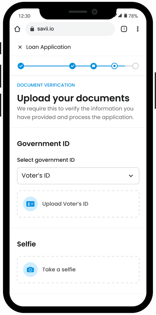

What documents do you need?
Primary IDs
Passport
SSS ID
UMID Card
Voter’s
Driver’s License
PRC ID
National ID or PhilSys ID
Secondary IDs
(2 are required if you don’t have a primary ID)
Postal ID
PhilHealth ID
Barangay Resident ID Card
TIN ID
PWD ID (with back copy)
IBP
PSA Birth Certificate
Company ID
An official ID issued by your company
Payslips
2 latest payslips
HMW-2
Preparing the user
To make sure the user is prepared and aware of all the documents needed prior to even starting the application, we decided to provide the user with a comprehensive list of all the required documents in the start in the navigation pop-up. The user would also be reminded right before they are about to move to the final step,
HMW-3
Solving for no primary ID
For the users who do not have a primary government ID. We introduced an option of ‘’I don’t have any of these IDs’ within the dropdown. Upon selection this allowed the user to upload two other secondary IDs that have been listed on the SAVii website. This would help us reduce the number of users that drop off because they did not have access to certain govt IDs.

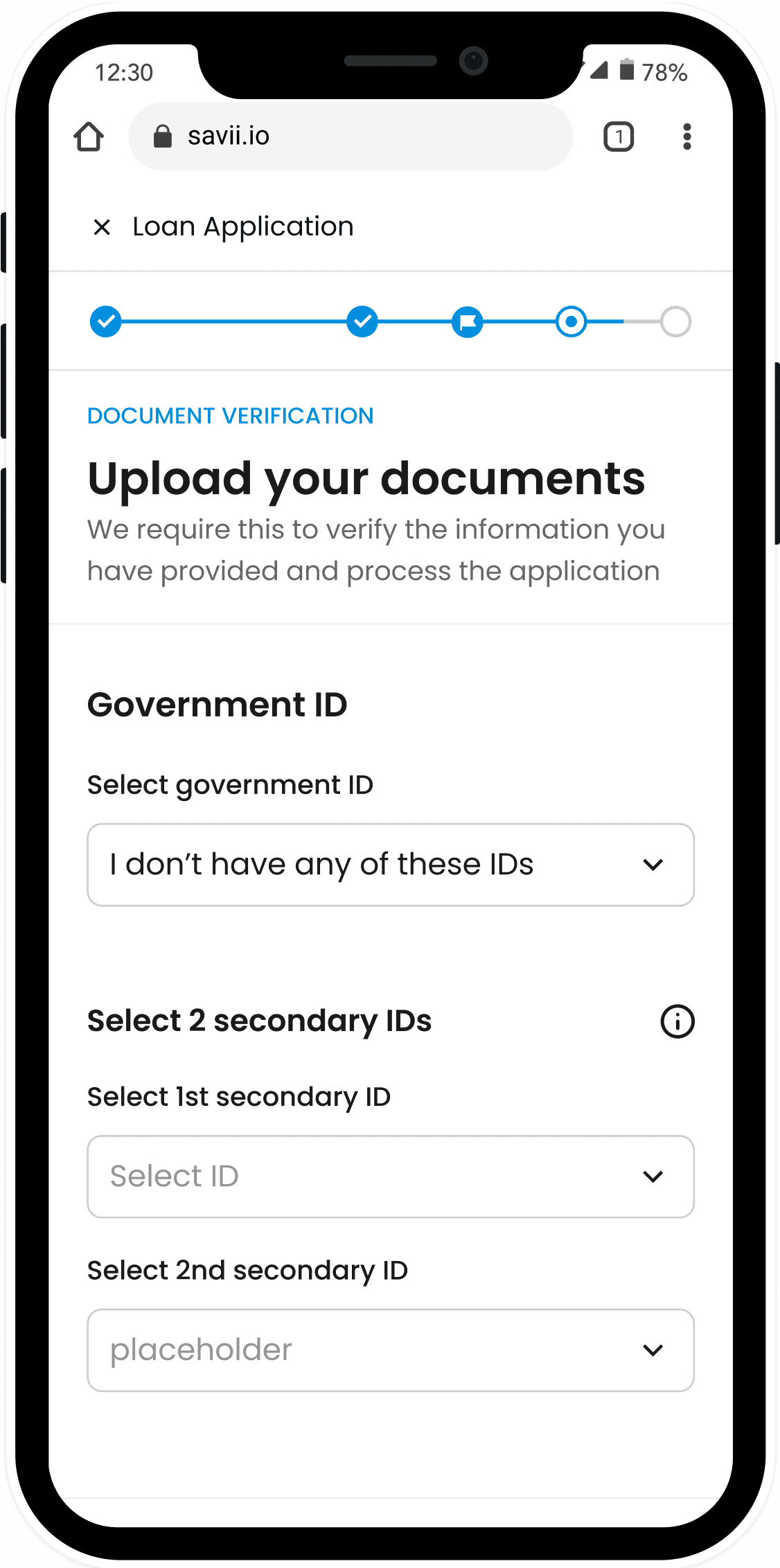

HMW-4
Guiding the user through the upload
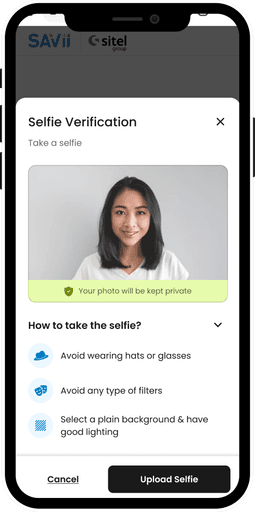
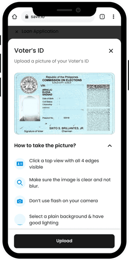
Upon document selection, we show the user a pop up showing a clear image of the selected document which serves as an immediate visual confirmation and reduces potential confusion
We also provide them with user-friendly tips on capturing high-quality images for all documents (including selfies).
HMW-4
Simplifying payslips
To simplify payslip uploads, we provided the required date ranges and specified the need for the payslips to be issued consecutively.

SUMMARY
SUMMARY
Final solution
Final solution
We streamlined the loan application process by focusing on three high-dropout screens: supporting information, loan offer, and document upload.
We streamlined the loan application process by focusing on three high-dropout screens: supporting information, loan offer, and document upload.
📌 Business impact
📌 Business impact
The redesign showed a 11% reduction in user drop-offs
Fewer rejections due to unclear documents
Post-application user feedback about their experience was more positive
Regrouped fields logically
Implemented progressive disclosure for low-priority items
Broke complex steps into smaller, manageable parts
📌 Improved Information Architecture
📌 Improved Information Architecture
Regrouped fields logically
Implemented progressive disclosure for low-priority items
Broke complex steps into smaller, manageable parts
Regrouped fields logically
Implemented progressive disclosure for low-priority items
Broke complex steps into smaller, manageable parts
📌 Guidance for users; they're prepared and better equipped
Provided clear navigation and previews of upcoming steps
Informed users about required documents in advance
Offered step-by-step guidance for complex sections
Provided clear navigation and previews of upcoming steps
Informed users about required documents in advance


Thanks for reading ❤️
To read the full case study, please view this link on a desktop. ✌️
Find out how
Explore page redesign boosts conversions by 20%
Next project
Search for “stocks”
Stocks & ETF’s you have been


Aditya Birla LTD
5Y CAGR
+116.5%

Adani group
5Y CAGR
+116.5%

Ambuja Cement
5Y CAGR
+116.5%
Available balance: ₹50
Add more funds to start a SIP
Find out how
Explore page redesign boosts conversions 20%
Next project
Search for “stocks”
Stocks & ETF’s you have been


Aditya Birla LTD
5Y CAGR
+116.5%


Adani group
5Y CAGR
+116.5%


Ambuja Cement
5Y CAGR
+116.5%
Available balance: ₹50
Add more funds to start a SIP

